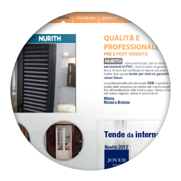
Radio Kiss Kiss
www.kisskiss.it
- web-app
- design
- cms
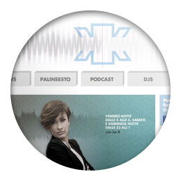
The website was optimized to be used on the most popular mobile devices, smartphones and tablets. You can not just listen to the radio, but also send instant messages to the editorial staff.
We used the latest web technologies, the user can listen to the radio without interruptions while browsing the website. Animations are handled to avoid slowing up the navigation, the structure was built on the graphics provided by Shicon.
The control panel interacts with Facebook and YouTube thus letting the administrators to upload mp3, images and video. The advanced management system is designed to ease the upgrades, in accordance to the high volume of contents.
All Innovation
www.allinnovation.it
- design
- cms
- e-commerce
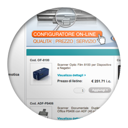
Instant search in Google style, Drag & Drop the products in the cart and animated growl-style messages, are just some of the unique features offered by our e-commerce platform, named Agorà.
The graphic of the customer was built on the structure of our e-commerce. Although the site does not have a dedicated graphic when visualized on tablets or on smartphones, it is designed to be accessible from any device.
The management system keeps track of stock movements, changing in real time their availability. It can import price lists and products from Excel file. Shipping costs based on weight, size and destination are automatically calculated.
Meglio Bio
www.megliobio.it
- design
- cms
- e-commerce
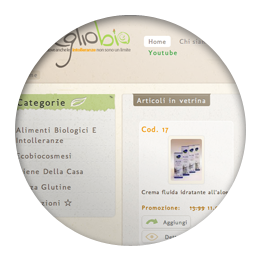
The site provides the safe handling of payments by credit card, social links and Google maps. Drag & Drop the products in the cart and growl-style animated messages are standard features of our e-commerce platform, Agorà.
The extensive use of textures that recall cardboard, typify the whole website, giving it a natural style typical of organic and healthy food.
From the management system it's possible to upload multiple images for each product and manage promotional offers for each item. It also automatically calculates the shipping fare, based on size, weight and delivery location.
1 e Mezzo
www.unoemezzo.it
- design
- cms
- e-commerce
The high resolution graphic elements, the interaction with videos and the clean look, complement the strategy of product presentation. In addition to the not conventional graphical structure, the e-commerce presents an original navigation system.
The e-commerce platform has been completely customized according to customer requirements. In addition to the online order management, payments from the website through secure protocols are also available.
To increase the efficiency of communication and the customer loyalty, from the control panel it's possible to manage, in addition to events, even photos of friends and press releases.
Dispensa Senza Glutine
www.dispensasenzaglutine.it
- web-app
- design
- cms
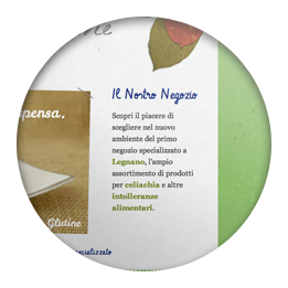
To provide improved usability of the website, the graphics and contents have been specifically optimized to be accessible on mobile devices.
To recreate the atmosphere of a natural and simple shop, we used graphic elements as leaves and raw paper. Through the use of calligraphic characters and sloped images, we created a website that would evoke the idea of "home made".
The website administrators can, at any time, promote and edit the events on the website through a simple control panel.
PlanAir Studio
www.planairstudio.com
- design
- cms
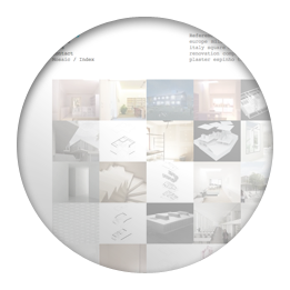
A clean and minimal graphics is essential for an architectural firm. The fulcrum of the navigation, based on tags that filter the image fragments, reflects the importance that Planair invests in research and observation.
From a control panel it's possible to manage all the projects, their images and the keywords for searching them in the "mosaic".
Beda House
www.bedahouse.it
- design
- cms
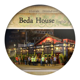
Through a combined use of graphics and textures, we gave to the website of the famous English pub in Milan, a retro-style. Some internal pages like Menu, Events and Register, bring the customers closer to the night events arranged in the pub.
Through a simple control panel the owner can add and edit all the events scheduled at Beda House.
La Miniera dei Beda
www.laminieradeibeda.it
- design
- cms
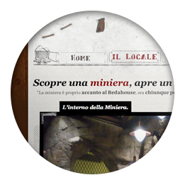
According with the decoration of the Steak House, the "Miniera dei Beda" website has a strong graphic strike accentuated by the use of textures, simple illustrations and animations.
Through a simple content management system, the website administrators can easily add, edit or delete the scheduled events.
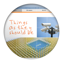
GSB Sicurezza
www.gsbsicurezza.it
- design
- cms
Composed of simple graphics and images, the site is clean and immediately comprehensible. Sections such as "ask an estimate", "plan the route" and "catalog" are a great resource for bringing closer new customers.
To keep the website always updated with the latest new products in the store, the content management system allows the owner to update the catalog, adding products and descriptions sorted into categories or subcategories.
Hanasck
www.maurobertame.it
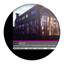
- design
The flash site has been rewritten in xHTML language, making it accessible also on Mobile Devices. The animations were re-written, the new structure facilitates the indexing of the content by Google and simplifies maintenance and upgrades.
Elite Taxi
www.elite-taxi.com

- design
A multi-lingual website created with simple flash animations and sound effects. The stylish graphics is an excellent introduction to the professionalism of their luxury taxi service.
SeleTech
www.seletech.com
- design
A professional website that incorporates Flash animation in an xHTML structure. The use of symbolic images and different colors based on the contents of the pages, creates a simple and clear communication.
ASGENAR NPO
www.asgenar.it
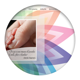
- design
The picture of a child and the delicate shades of color, suggest a simple website with a strong communicative impact. The careful chromatic choice reflects the philosophy of the NPO association that commissioned the job.